Photos
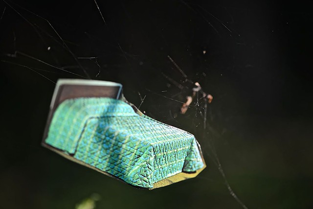
These images are from a series titled Better Homes. Upon first glance the images appear to be collages. However, closer inspection reveals that they are actually images cut from Better Homes and Gardens magazines; strategically placed in actual everyday settings, then photographed in those environments. I love going out into the world with my collection of fragile magazine cut-outs, looking for unexpected locations to place them. Inspired by backdrops used in movie and television sets, I’m intrigued by how these fictitious flat environments communicate space and confuse scale. There is something about the miniature that awakens the child within, the child that still believes in magic. A bed is cradled by a cobweb; a chandelier hangs from a branch.
When I was a child, I spent hours longing for the magic in my imagination to become real. As an adult, the things I find myself daydreaming about now are much more pragmatic. I imagine that if I had a more organized house, matching throw pillows, or a charming mason jar table setting, then perhaps the life that is lived around those objects will be as rich and fulfilling as they appear in magazines. Ad photography is so seductive, it presents us with a reality that is so familiar but ultimately unattainable. Even if you purchase those matching curtains, the sun will fade them; they will gather dust. The process of creating these temporary installations of imagery and objects allows me, to fall deep into the realm of play, as I seek out a location, pose and position my props; seeing the unfolding scenario I’m creating become real. Photographing these places creates for me a liminal space suspended between reality and fantasy where I escape from the world while being right in the thick of it.
